Almara Soap
client
- Almara Soap, s. r. o
Services
- Packaging Design
- Graphic Design
In 2021, Almara Soap, Czech manufacturer of natural soaps and cosmetics, feld the need to redesign and modernise their product labels and packaging.
The old design of labels and packaging used until then no longer met their needs and requirements:
- 1) simplicity and readability
- 2) unification of names and categories of product lines, easy to change the language of labels for individual European markets
- 3) easy orientation of end customers in individual product lines
My challenge was to make the new design to correspond to the requirements, the brand identity and what it represents on the Czech and European markets: high-quality natural cruelty free products, personal approach, responsibility towards yourself and nature. My intention for the redesign was minimalism with maximal space for the message and the variability of the layout, which will meet demanding requirements and at the same time be gentle and without gender stereotypes. So regular customers do not feel alienated and future customers will be able to immediately recognize it and thus include Almara Soap in the right direction that emphasizes cleanliness, safety and sustainability.
Foto of products © Almara Soap archives

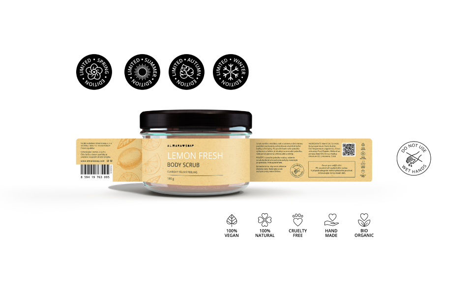
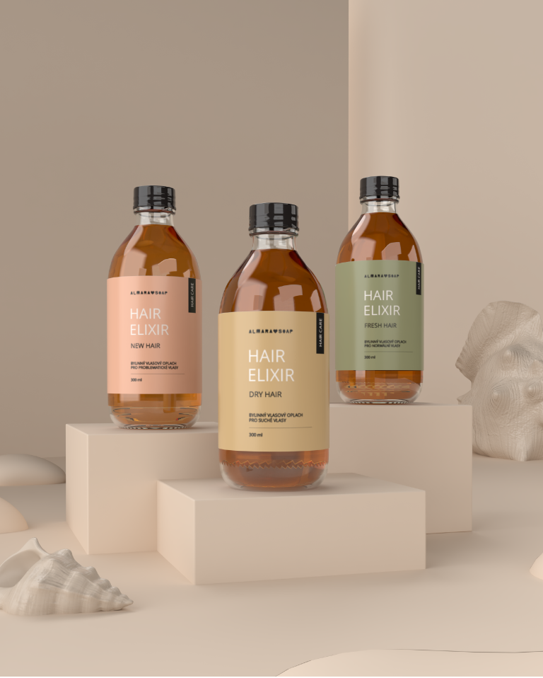
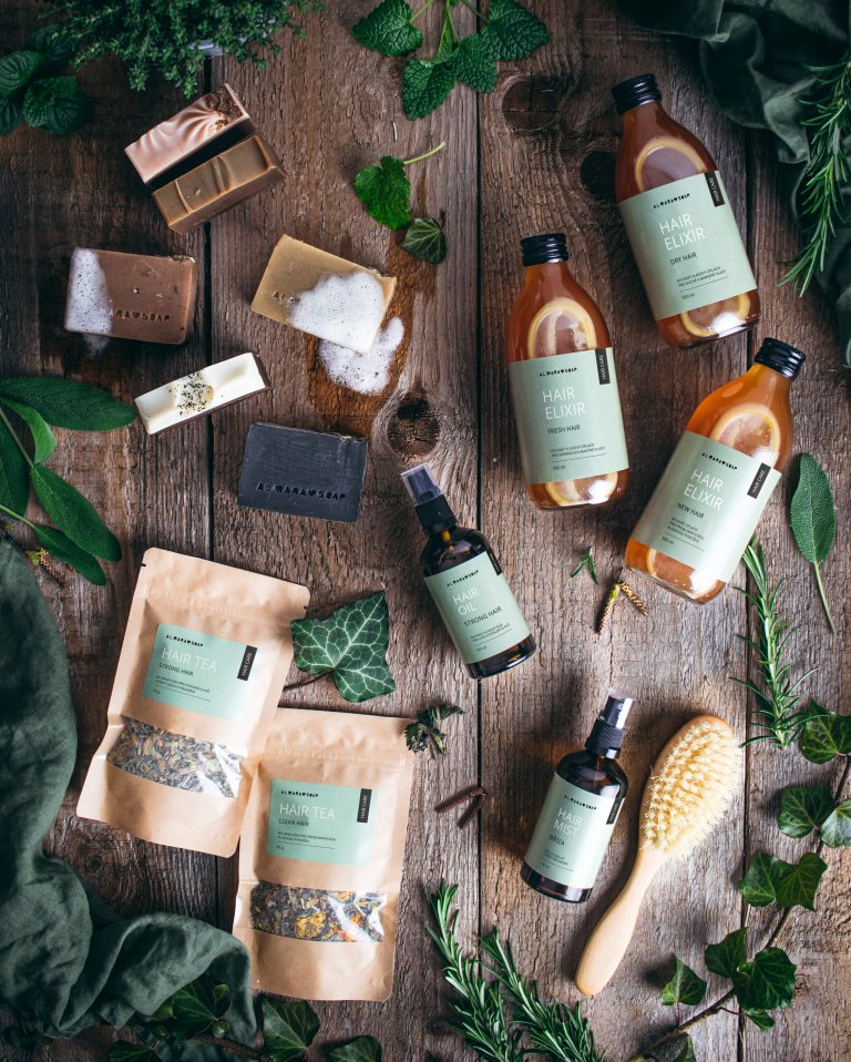
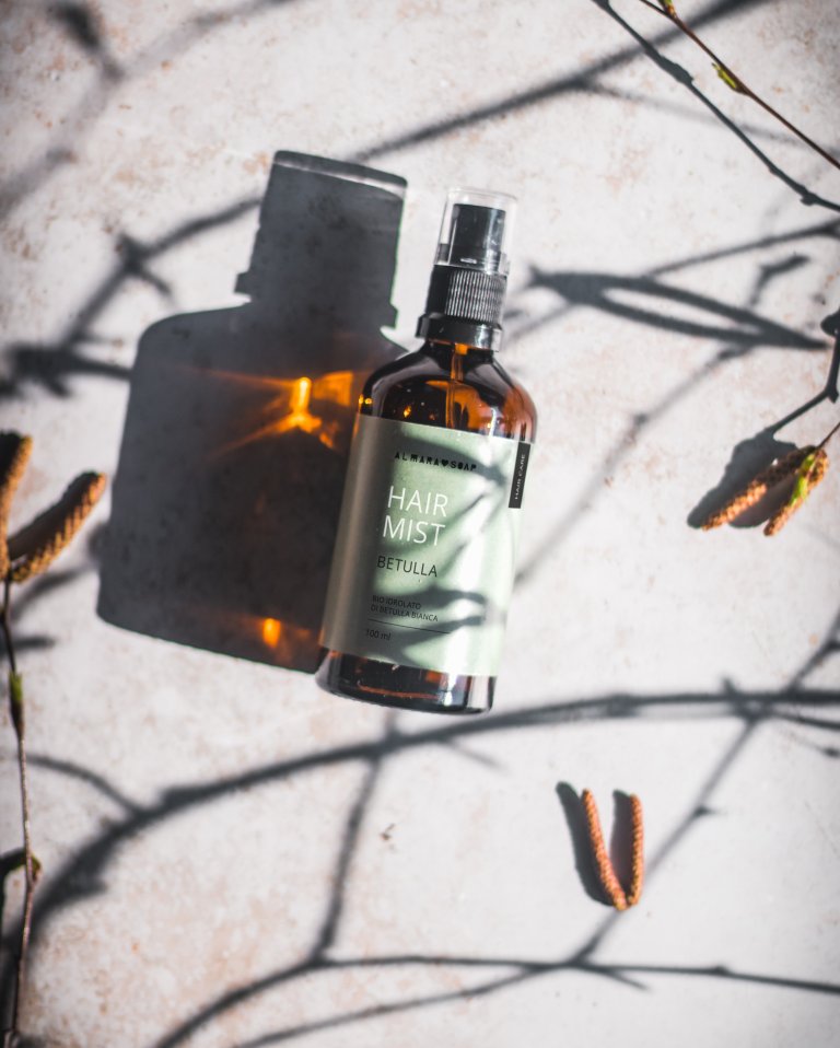
Hair Care
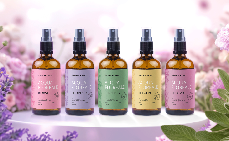
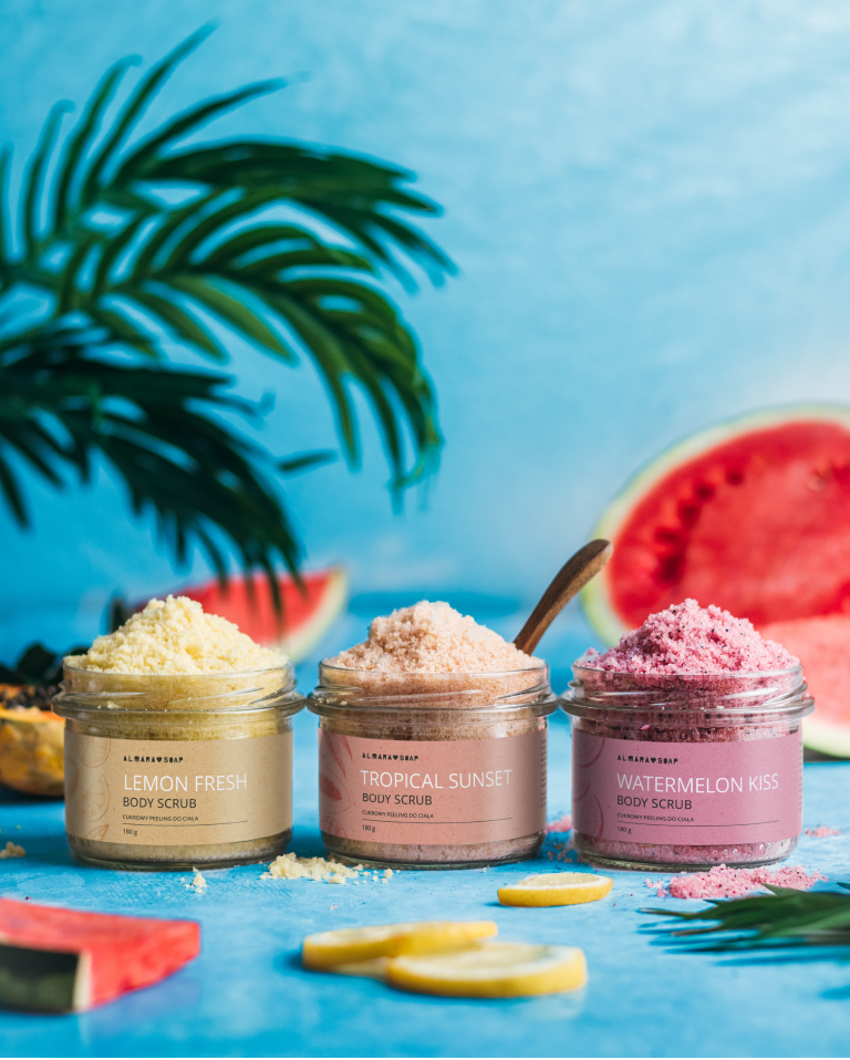
Almara Soap's expanding product portfolio resulted in the need to distinguish certain product lines from others, making it easier for end customers to navigate themselves in product lines.
To clearly identify individual product lines we started using "Tag-label" and differentiating colors.
Hair care product line - these included hair vinegar rinces and shampoos for the specific hair types, but as the product range continued to expand, there was a need to consolidate the visual appearance of the hair care line, separating its products from other skin and body cosmetics.
The printed tag-label unified the category of hair products and at the same time became a reference to the beginnings for die-hard fans of Almara Soap.