Zcestovalá
Client
Zcestovalá, s. r. o.
Services
- Visual identity
- Logo design
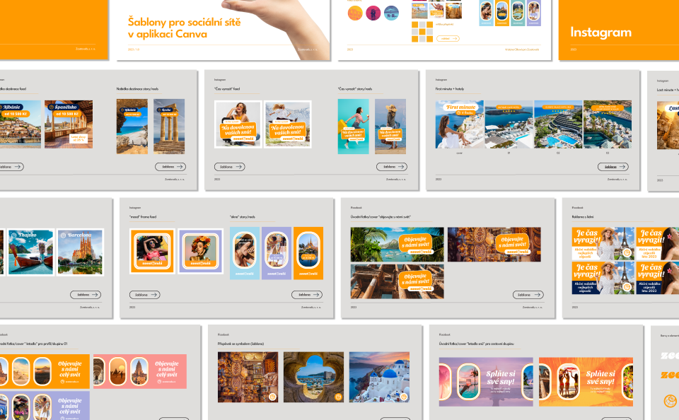
- Canva templates
Zcestovála, s. r. o., is a young travel agency focused specially on women of all ages. The owners of this travel agency are two young and energetic women who wish the brand to reflect their own philosophy too. The request was for a distinctive design that would distinguish this travel agency from others currently operating on the Czech market and make their brand recognisable to customers as well.
Holidays, sun, fun, travel and memories of my childhood trips with the only travel agency available once upon a time in Czechoslovakia - these were the main source of my inspiration for the creation of this brand.
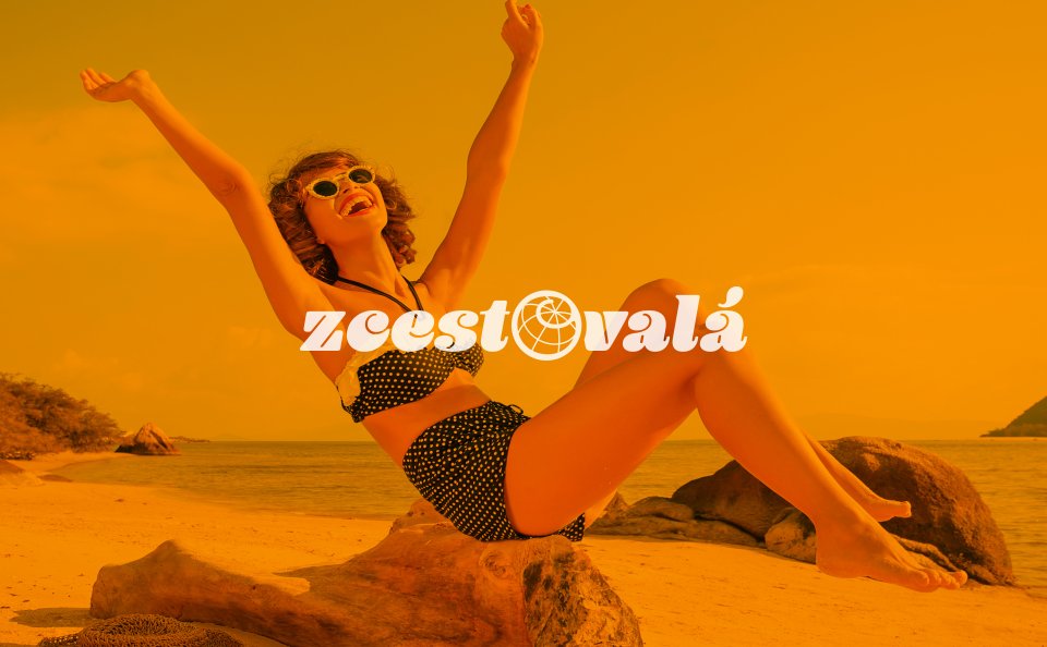
The basic version of the brand is in deep yellow - embracing, warm and rich. This color represents the sun and the destinations that are bathed in it. The rotating globe evokes journeys, but it is also a beach ball with which we had so much fun by the water.
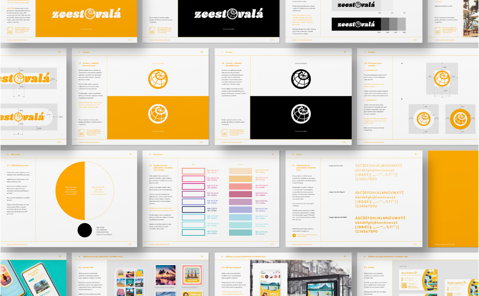
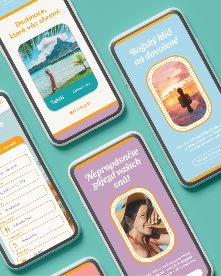
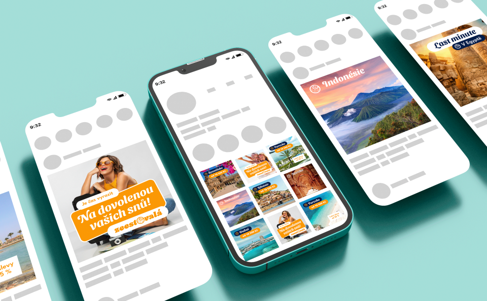
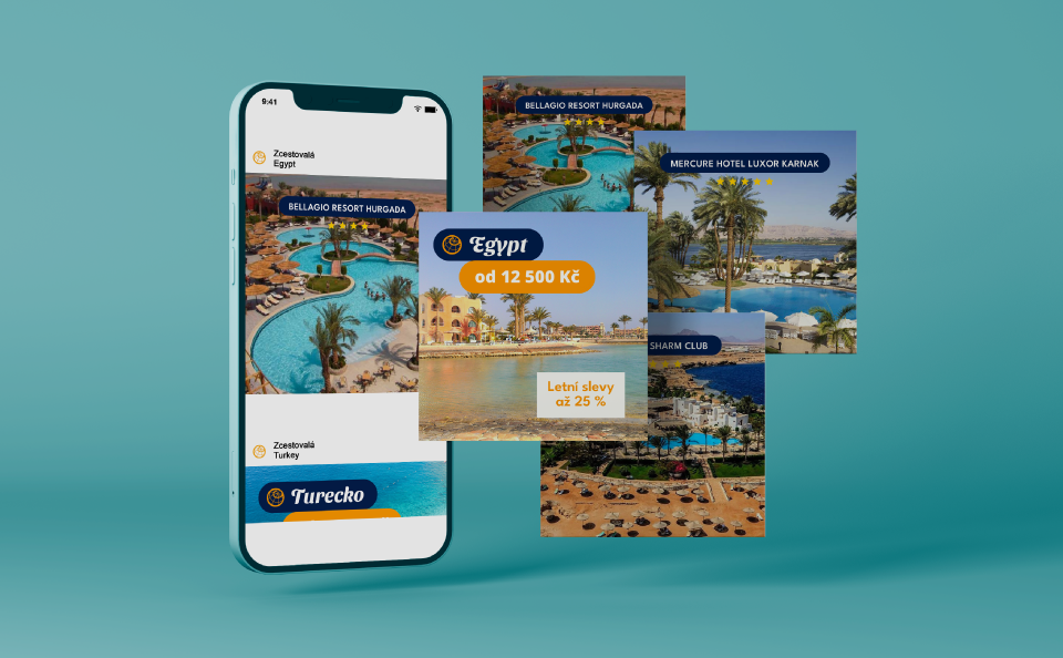
The visual identity guideline also includes examples of its application, for example on a website, posts for social networks or an advertising campaign. The "Unicorn Rainbow" color palette of complementary colors consists of complementary shades to the main color which transport you to the world of fantasy, fun and relaxation just like tours from this travel agency.
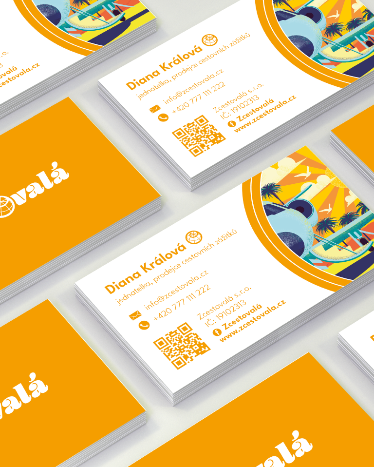
Printed materials such as business cards and other stationary for basic communication with clients or partners respect the basic colors of the brand's visual identity and communicate reliability and care through integrity.
